For the year 2021, the Pantone Institute has proposed a combination of two colours – subdued grey - Ultimate Grey and radiant yellow – Illuminating.
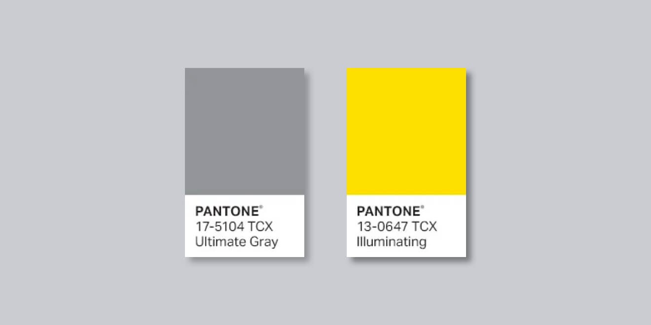
The first colour can be associated with practicality and reliability that inspires confidence, and with the solidity of stone or concrete. The other connotes solar energy, optimism and the joy of life. According to the Pantone experts, their combination symbolizes strength, deep reflection and hope for a better future.
The Pantone press release states that these two independent colours juxtaposed with each other show how two completely different elements can be combined into one. Together, they create a message full of strength and hope that is not only supportive but also uplifting. It is not just about one colour or one person, it is more than that. “The combination of subdued grey with vibrant and radiant yellow conveys a message of positivity and fortitude”, adds Leatrice Eiseman, the director of the Pantone Colour Institute.
PANTONE Colours of the Year
The annual announcement of the colour of the year by the Pantone brand is always a long-awaited moment for anyone who is interested in broadly understood design and style. Pantone's undisputed prestige cannot be denied. Colours according to the Pantone® Matching System® parade the world's catwalks, and appear in the projects of international graphic, advertising and architectural companies. The system is used by state authorities to describe the colours of national flags (in e.g. the United States, South Korea and Canada). The American corporation has been announcing its famous Colours of the Year for 16 years and is one of the leaders in setting trends in the current global lifestyle.
What exactly is this palette, where did it originate from and why does it arouse such interest?
PANTONE® MATCHING SYSTEM®
Pantone is not only one of the most famous colour guides, but also a research institution that announces Pantone Colour Of The Year about a month in advance. The company sells a great number of products and services along with thousands of certifications in many countries, operating wherever design of any kind is involved, from graphics to fashion and architecture.
The colours in the palette are marked with a number with additional markings such as fluorescence, metallicity, etc. The basic scale describes 1761 colours. They are made by mixing 18 pigments – including black and white. Hence, their representation using the CMYK and RGB scales is not an easy task.
The Pantone Institute was established in 1986 in the United States. From the very beginning, the Institute has brought together a group of recognized specialists in the field of colour design. Expert colourists, active in a wide range of industries, from textiles to engineering design, bring their insights into colour trends from a very broad market area.
Research on colour trends has its economic justification. The institute provides colour consultation for designers, brands and anyone else who believes that the impact of colours on people is a fact, not charlatanry, and that trend setting is a systematic analysis, not fortune telling.
Pantone Colour of the Year.
This honourable title is not awarded just like that! Since 2000, representatives of branches from different countries have been meeting in a chosen European capital to discuss and present their opinions for two days, twice a year, which results in a selection that must be approved a year in advance. The results have been published since 2004 in a special guide for designers, PantoneView, which sets the standards for the upcoming season.
According to the Institute itself, predicting colour trends is a complex analytical and rational process which has its roots in the current reality. Colour is treated as a form of a message that reflects cultural changes. The methodology employed by the Institute aims to identify the most expressive trends emerging in the world of design. Next, these trends are analysed in terms of their suitability for industry and confronted with the present cultural landscape. The analysis covers current film productions, the tourism industry with its most popular destinations, pop culture phenomena, fashionable lifestyles, the fashion, art and design market, as well as the global socio-economic situation and the problems we face on a daily basis.
The result is a list of the most recent trends presented as a coherent visual story. This story is supposed to reflect the current reality as accurately as possible and refer to the current needs of people around the world... with the help of colour. According to Pantone, the choice of the colour is dictated by the zeitgeist, i.e. spirit of the times.
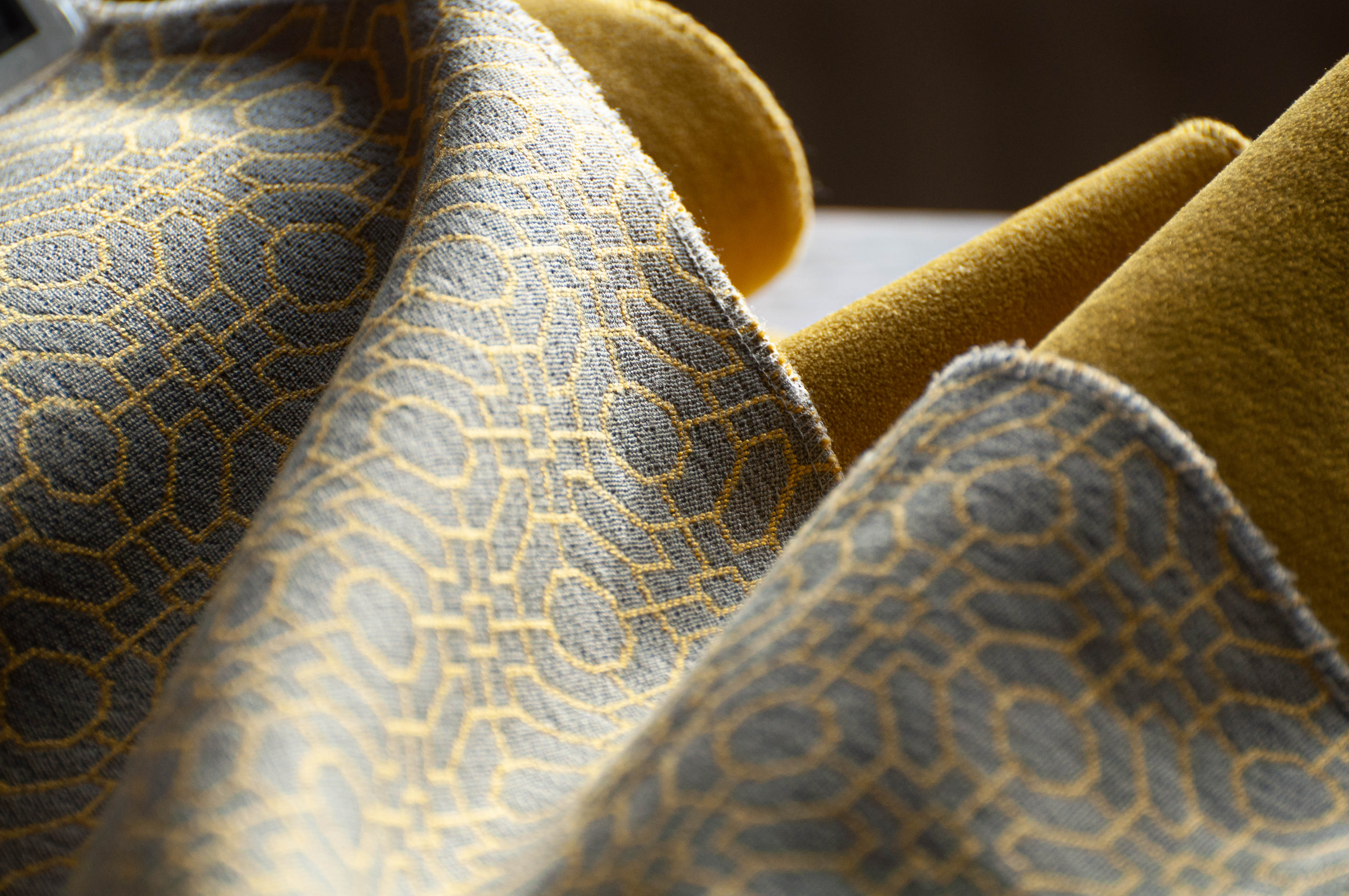
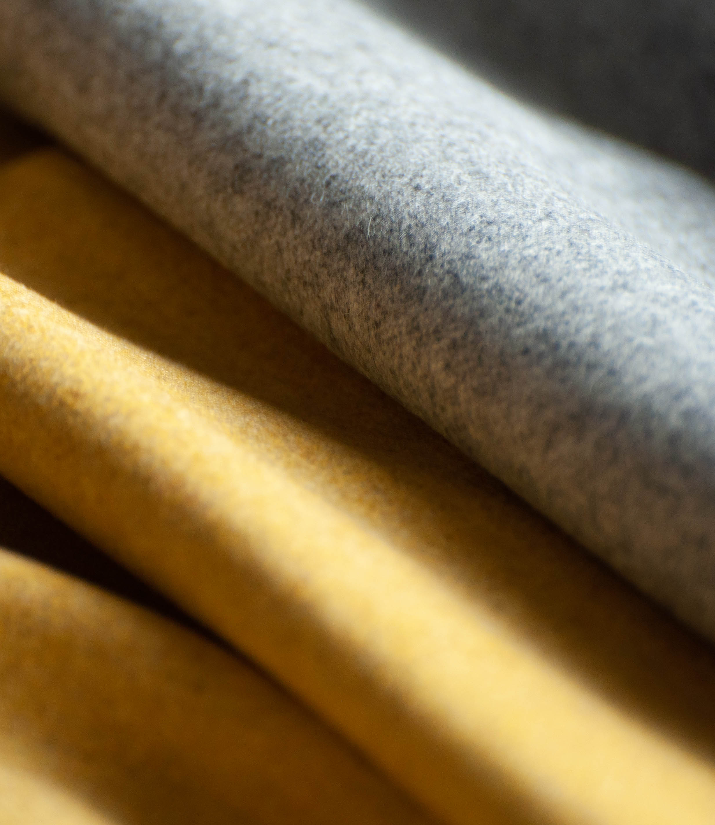
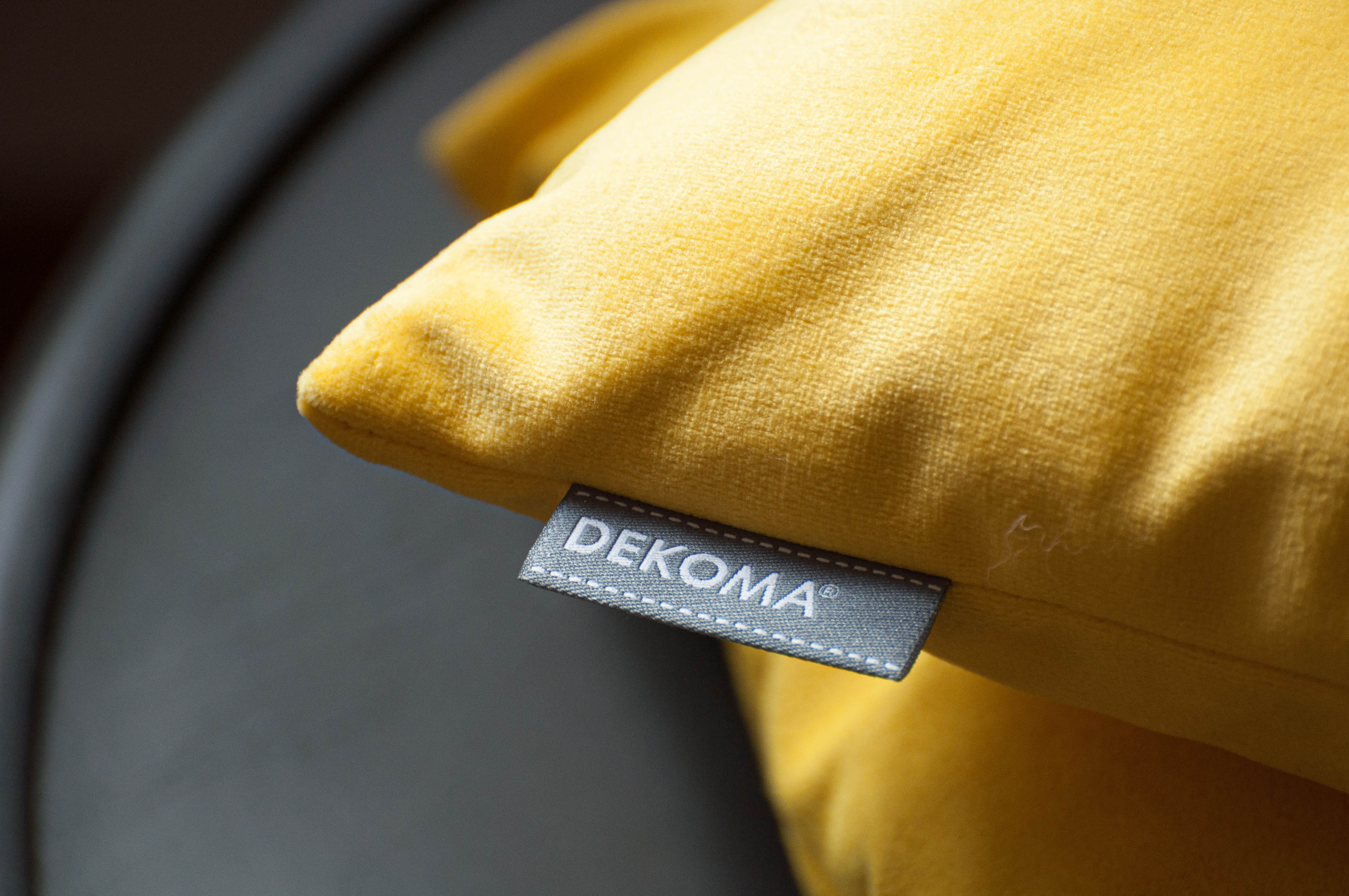
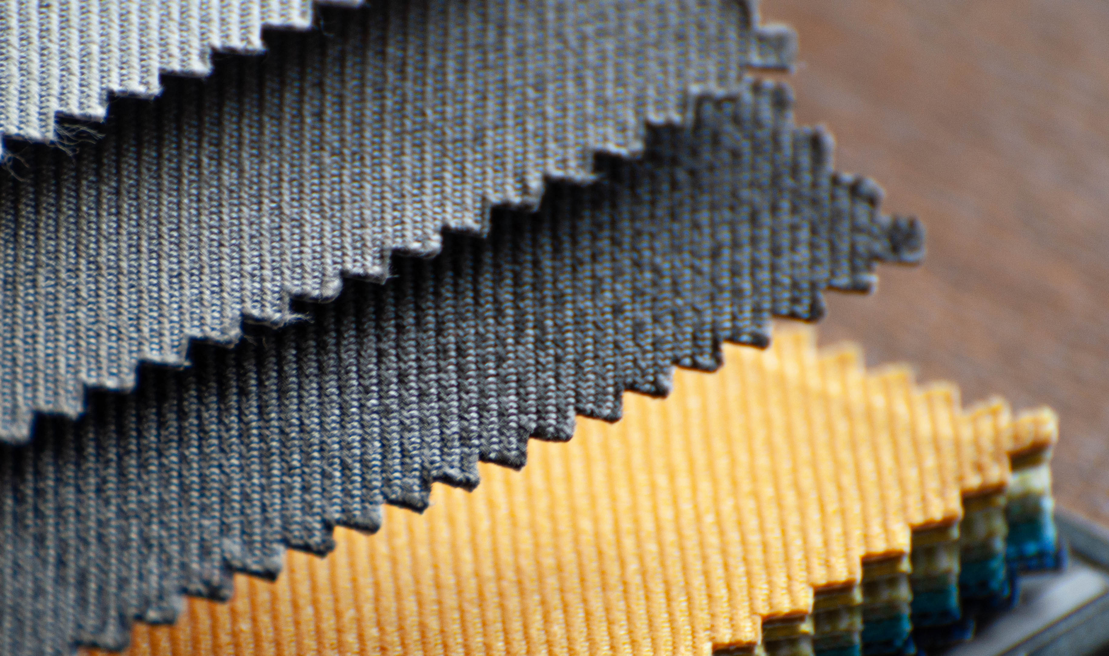
Fabrics from the DEKOMA collection used in the session:
Charles is a velour upholstery fabric with a high resistance to abrasion (90 000 Martindale cycles). It is available in a wide spectrum of colours from strong, warm tones of brown, red and orange to cooler blues and greys. It is recommended for modern interiors. The fabric has a protective finish and is easy to maintain – it can be either hand-washed or dry-cleaned.
Sator is a durable, two-tone furniture fabric with a subtle texture. Its composition including olefin, makes it perfectly suited for use in outdoor furniture. Sator is highly resistant to UV radiation, humidity, water, oil and mould. It is also pleasant to the touch.
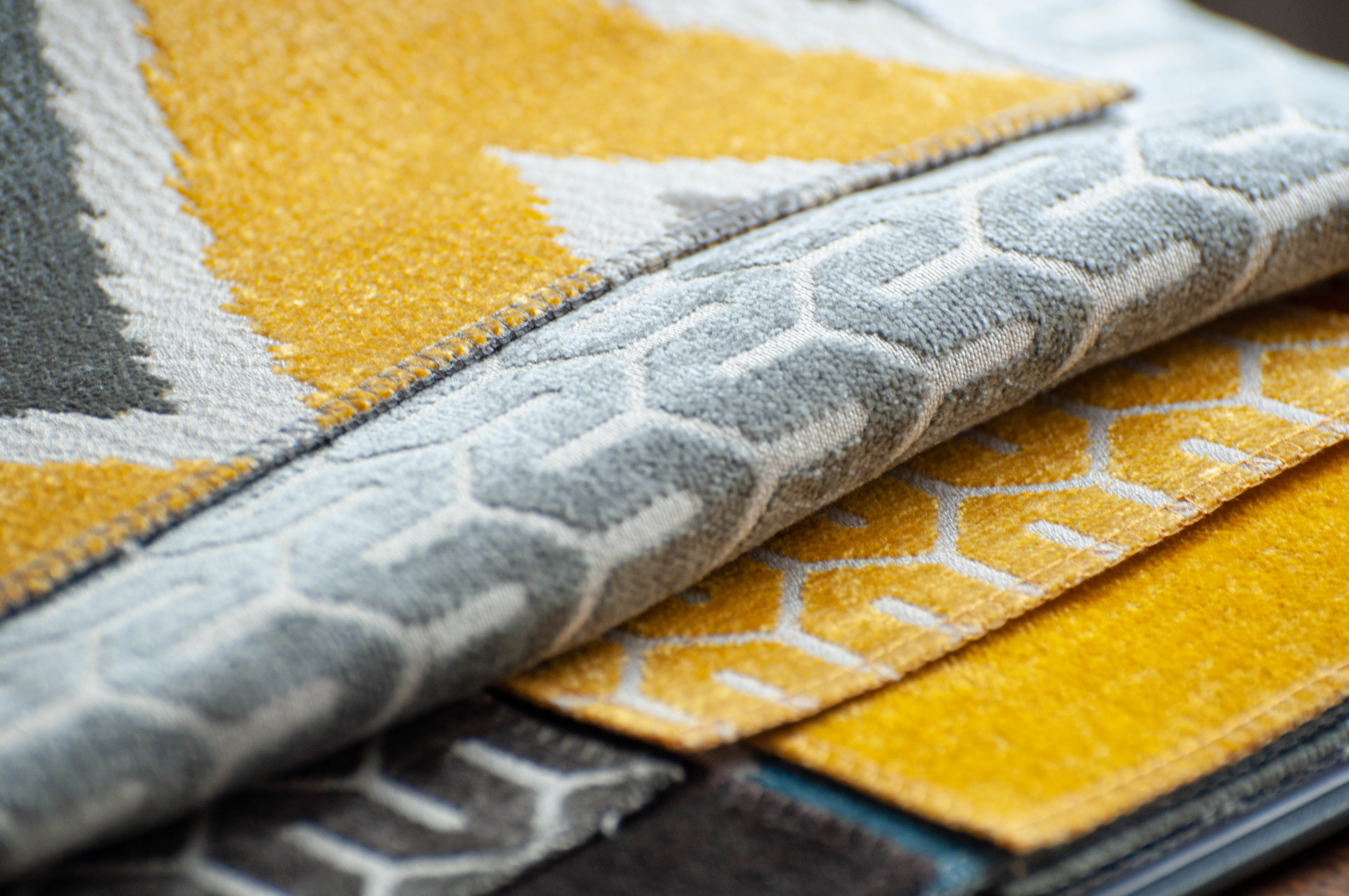
Eritrea is a soft, chenille, jacquard upholstery fabric. Its differentiating feature is a graphic ethnic pattern with a large repeat. Eritrea is available in 5 colour versions: grey with a yellow zigzag, mineral combination of greys with blue, teal accents, a modern flamboyant combination of ginger and cobalt blue, and more sober brown and grey variants. The fabric is recommended for ethnic household interiors and for individuals who like intense accents in a sober space. Its coordinates are plain Henry FR velour, available in 89 colours, or Tunis echoing the colours of Eritrea's patterns.
Tunis is a soft, chenille, jacquard upholstery fabric. Pleasant to the touch, it boasts a graphic meander pattern. The lines are reminiscent of a maze, painted Moroccan ornaments, or house lines in urban structures. Available in 10 colour variants, Tunis is recommended for ethnic- and modern-style interiors. It can be combined with Eritrea from the same collection, or the plain Henry FR velour.
ASMARA is a chenille fabric of standard 1.40 m width, catching the eye with its unobvious texture. Pleasant to the touch and resistant to abrasion (30 000 Martindale cycles), it is recommended for upholstery, perfectly complementing the ERITREA collection. ASMARA is available in 14 colours serving as coordinates to the ethnic patterns of ERITREA and TUNIS (these are greys, different shades of reddish-brown, and yellow-golden hues, complemented with browns and fine shades of turquoise). Used individually, the fabric is recommended for modern-style interiors, and when used in combination with TUNIS and ERITREA - for ethno- and colonial-style designs.
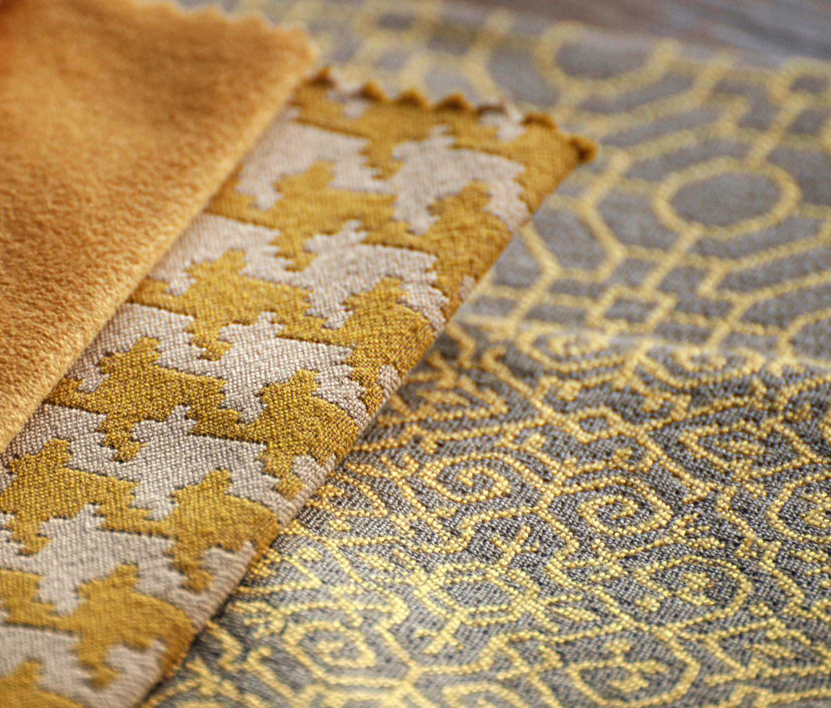
The fabric in a distinctive, classical dos-tooth, to choose from eight colour sets. Recommended as a decorative and upholstery fabric for household furniture. An interesting proposal to classic and modern interiors, for people who like geometric patterns in trendy colours. Trends 2015: Mixology
Fabric with geometric pattern resembling maze in five colours. Recommended as a furniture and decorative fabric for private interiors in classic and modern style. Trends 2015: Mixology
Furniture and decorative fabric with bright, dense, geometric pattern on a darker background. Recommended as a fabric for household furniture. Palette of five fashionable colours. Trends 2015: Mixology
Noble, densely woven woollen fabric to use in upholstery with the possibility of decorative application (e.g. for pillows). It has good technical parameters - it is naturally flame-retardant; passes the cigarette and matches test, according to British standards of fire resistance. It comes in a palette of more than forty beautiful shades, including both the colours of nature (earth, grass, stone), subdued - beige, browns, creams and greys, as well as unusual for wool juicy, expressive strong colours: fuchsia, plum, eggplant and emerald green.
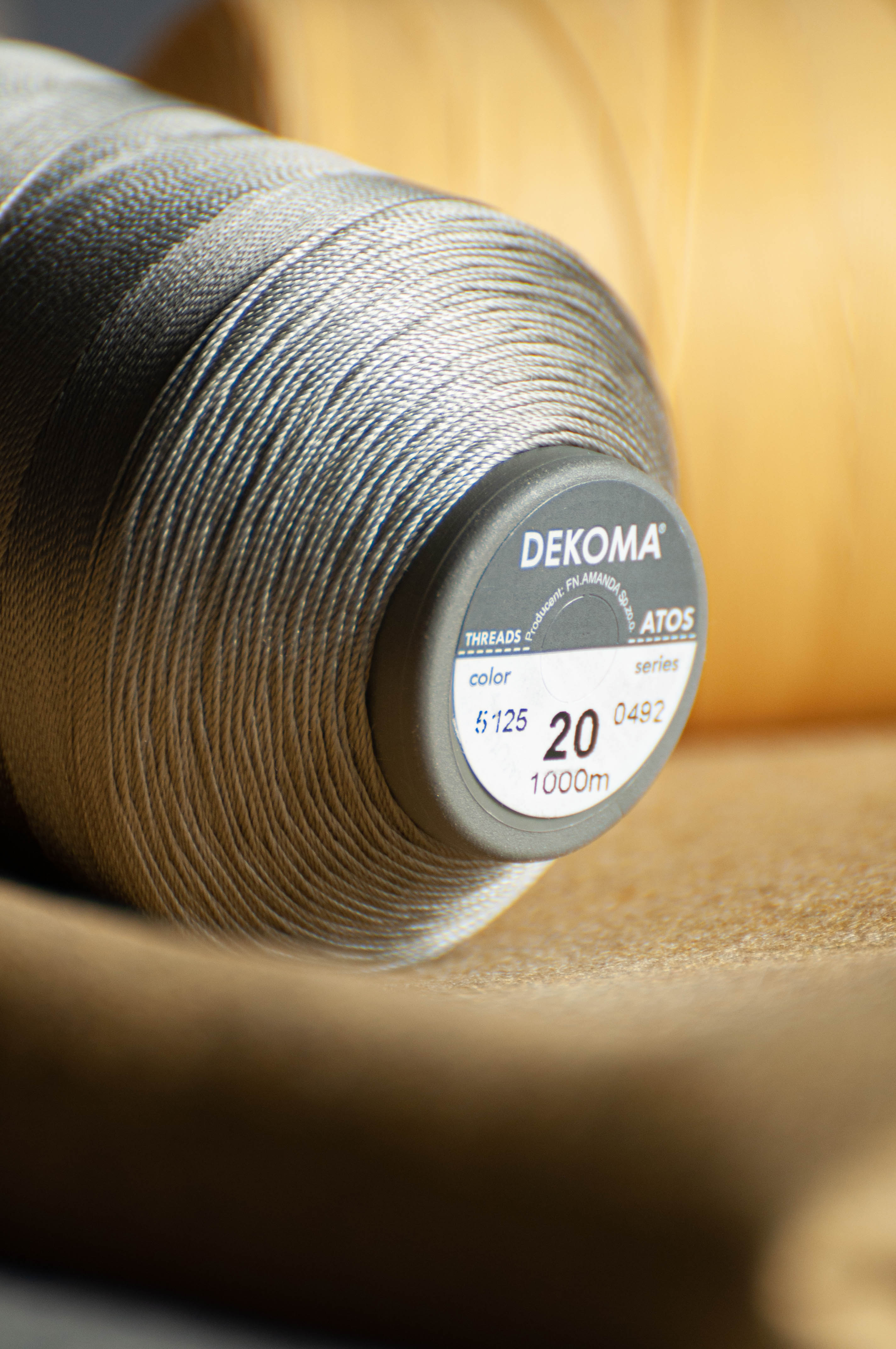
The ATOS collection features threads perfect for sewing and decorative quilting of fabrics and leathers. They are made of high-quality solid polyester fibres, very resistant to wear and to extreme weather conditions. They make your seams look great and last long. The range of available colours matches the collection of our fabrics. The distinctive delicate gloss of our threads gives an elegant look to all seams. The length of the thread on a spool is 1000 m.
Photo-session for Dekoma.
Photographs, content, and text: MBBM Studio.